Reworked structure and navigation
Company: Riksbyggen
My roles: UX research, UX/UI design
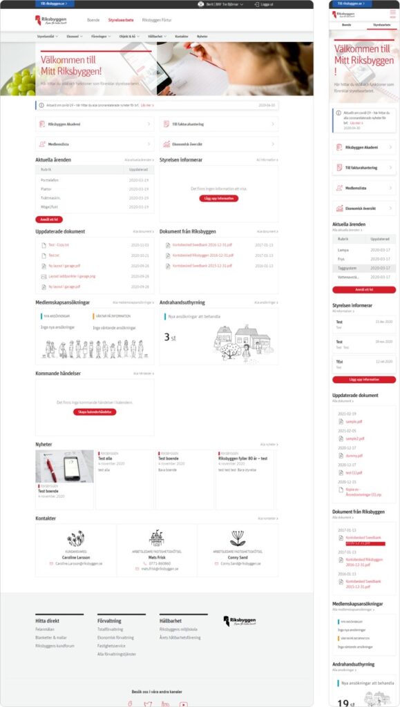
Short description: Based on input from customer service as well as a recurring usability survey conducted by Riksbyggen, we learned that customers found it complicated to get an overview of the content on the homepage of “Mitt Riksbyggen” and also difficult to find in the navigation.
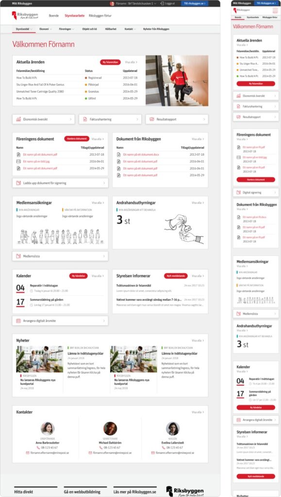
To target these pain points, we reworked the structure and design of the home page and navigation.
Result:Great reduction in time number and of clicks users spend to reach their goal.
Introduction
Riksbyggen is a housing and real estate company, and “Mitt Riksbyggen” are the logged in pages where residents, condo association board members and other user groups can communicate and manage things related to the association, the housing or the real estate. For example booking of common areas like laundry rooms or guest apartments, but also manage invoices, meeting protocols, joint documents etc.
Due to the nature of the discovered pain points, we decided to approach this in two ways simultaneously:
- The structure and design of the home page(s).
- The structure of the navigation menu.
Step 1: Evaluate and analyze the current situation
To get a better sense of the current state, I started by analyzing and evaluating the current situation.
General
- Google Analytics data (mobile vs desktop usage, and much other visitor and usage data)
- Compiling the customer feedback received from a yearly usability survey.
- Interviewing and compiling insights and knowledge from customer support and other stakeholders.
Home page
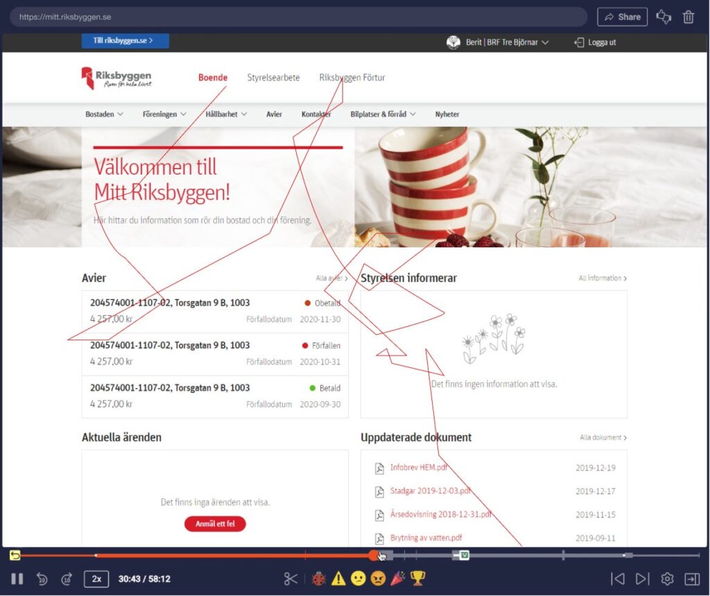
- Behavioral analysis using Hotjar recordings.
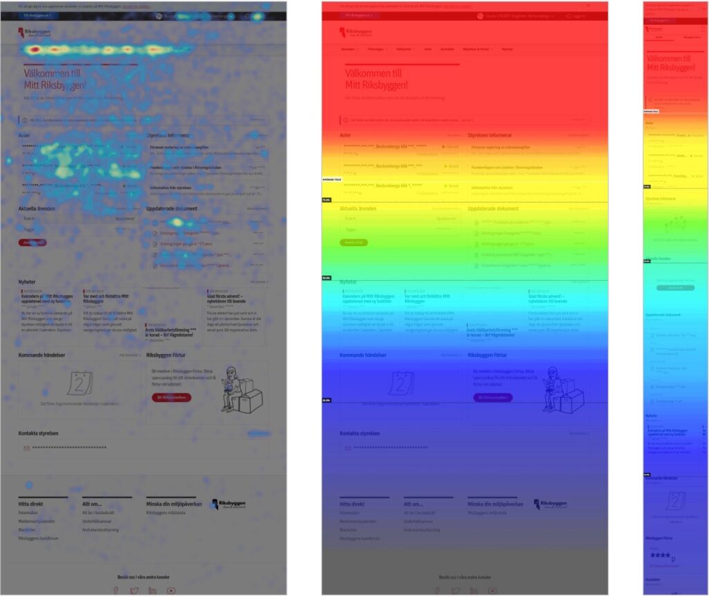
- Heatmaps to learn more about scroll depth, mouse movements and clicks/taps.
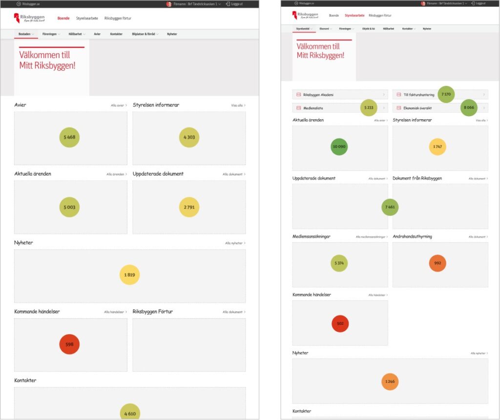
- Importans mapping
Navigation
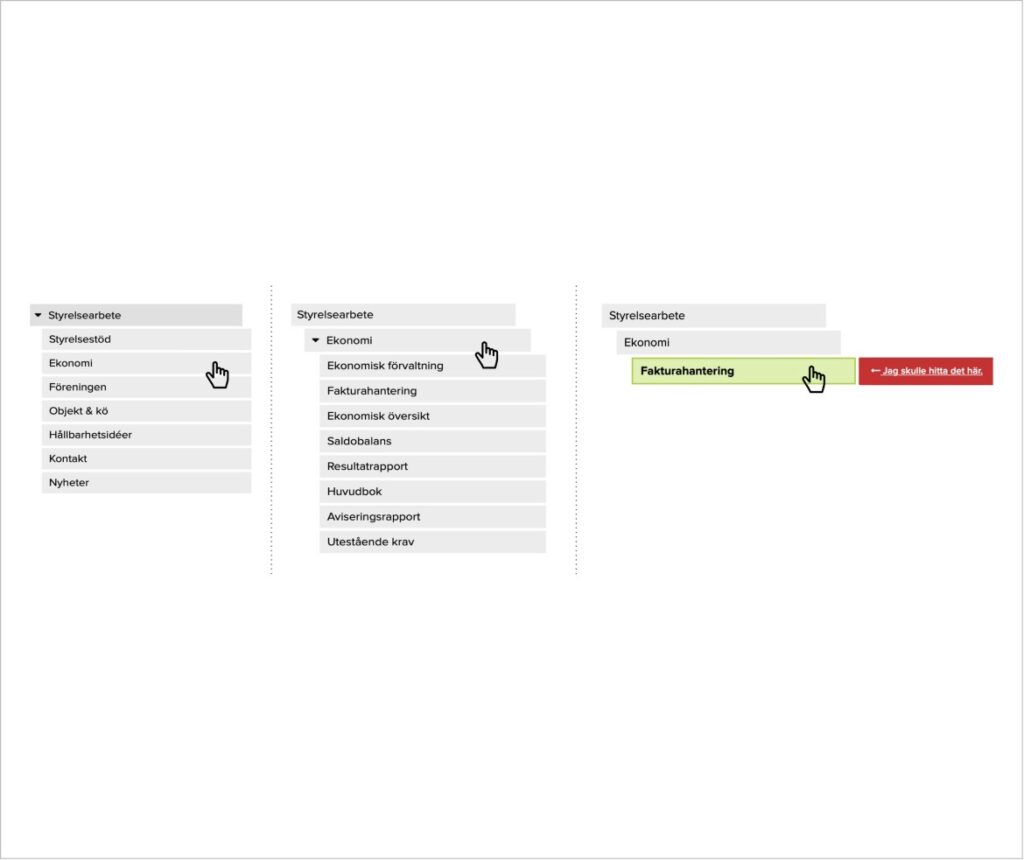
- Tree testing
The users of “Mitt Riksbyggen” belong to 9 different user groups with different needs, the two main ones being residents and board members. The analysis was done with this in mind to make sure we knew how to meet the needs of each group.
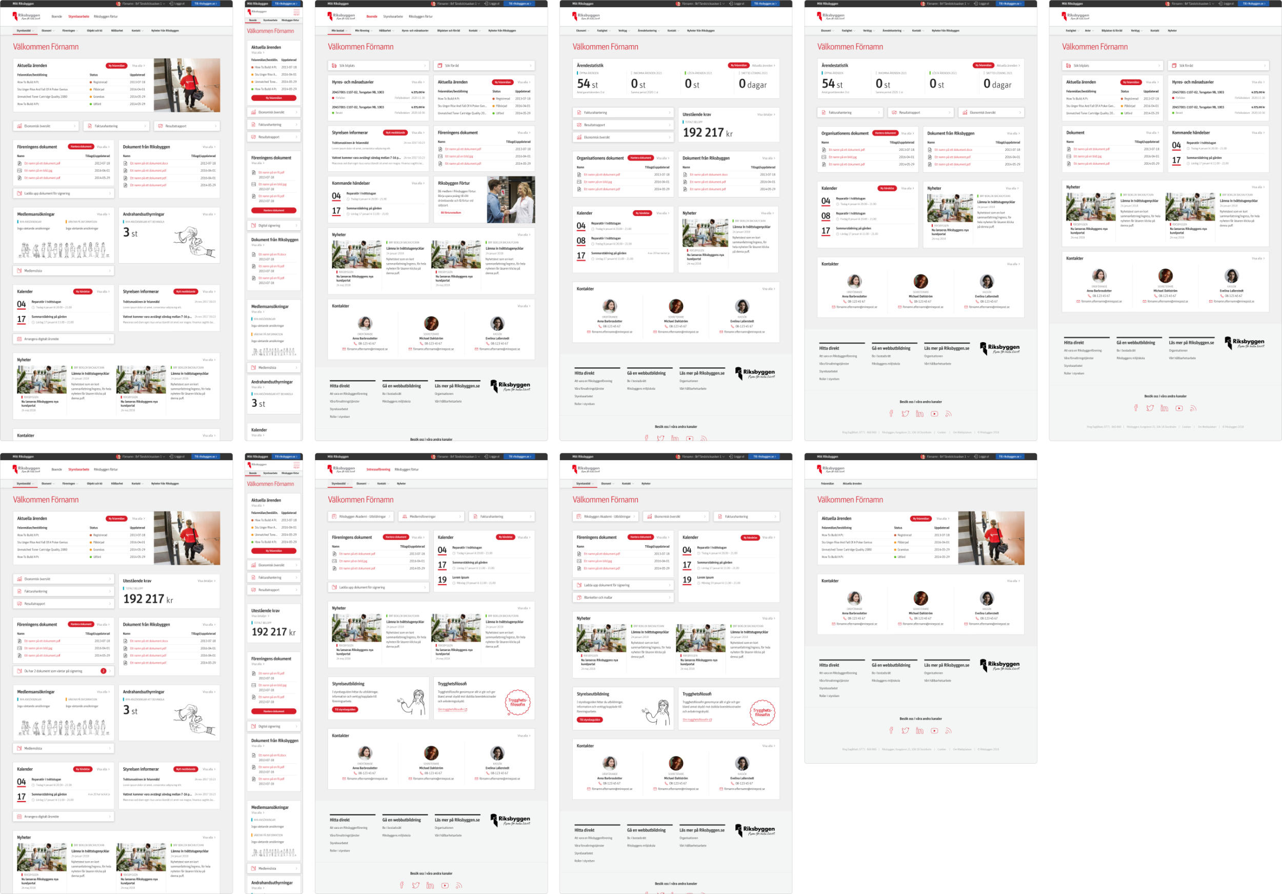
Step 2: Hypotheses, prototypes and usability testing
Based on the insights from the previous step we started creating hypotheses as a foundation for prototypes and usability testing.
General
- By replacing technical terms and internal wording with expressions that people in general use and understand users will more easily find what they are looking for.
Home page
- By decluttering the design the content will be easier to scan.
- By re-organizing the content based on usage and importance and adapting this differently based on each user group, it is more likely that the users quickly find what they are looking for.
- By dynamically showing relevant and/or urgent details on the home page the users more rarely have to navigate to sub pages to find the details needed at the moment.
- Bonus: By creating empty states that promote relevant features the users can discover them and get more value out of “Mitt Riksbyggen”.
Navigation
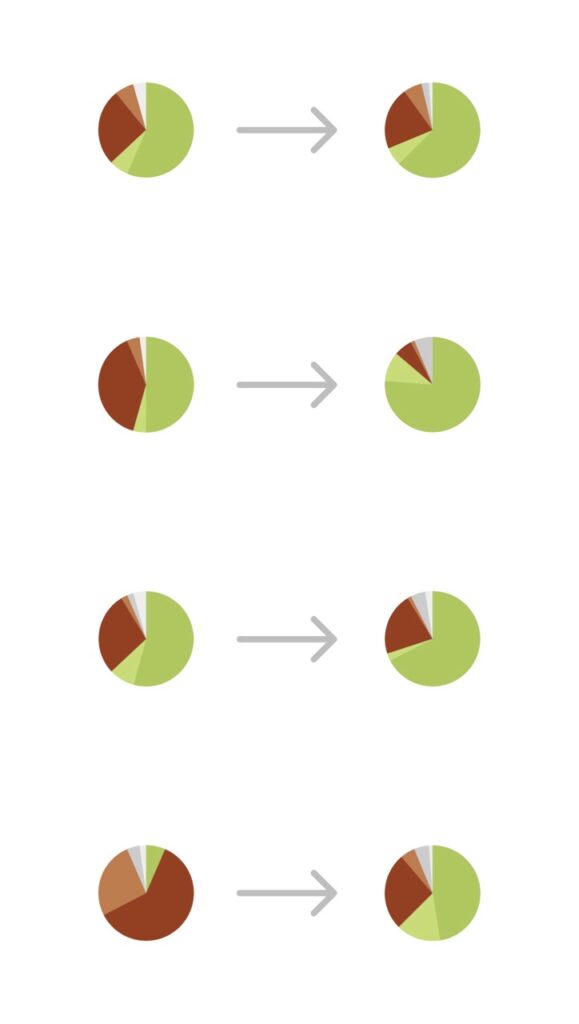
- By re-working the structure and namings in the navigation menu we will help the users find what they are looking for easier and faster (conduct new Tree Testing to verify).
Step 3: Implementation and results
I handed it over to the developers for implementation, but the new home page and navigation structure wasn’t launched until after I left Riksbyggen and moved on to my next job at H&M. But I have been in contact with the product owner of Mitt Riksbyggen, and she informed me that the results were good with great impact both on the time and the numbers of clicks users spend reach their goal.
Step 4: To the future and beyond…
Before I left I also handed over ideas and thoughts based on insights from the research, on how to make the home page more dynamic and personalized.
I also recommended them to keep analysing usage patterns on live data and be responsive to user feedback after the launch. But also be cautious to take action on this too early based on my experience that change can be frustrating to start with for existing “power users”.
Get in touch
I’d love to get in touch with you to hear about your goals and vision for your website or app. So don’t hesitate to send me an email or a message on LinkedIn.
…and hey! If we meet in person I will make sure to bring my favorite Swedish candy “Dumle-kola“. I think you will love it too :).
