Reworked order flow
Company: Loopia
My roles: Project leader, UX researcher, UX designer, prototyper.
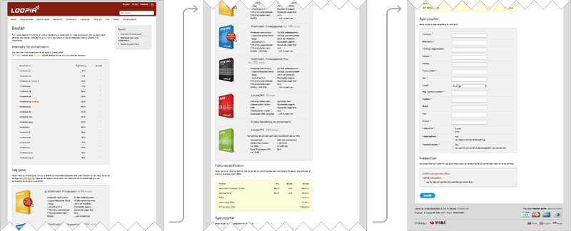
Short description: The previous one-step order form was well suited for the few products Loopia offered when it was designed. As time went by Loopia’s product portfolio increased dramatically (and is still growing). This resulted in a very long order form and difficulties for the customers to find and pick the right products for their needs. Drastic changes where needed to improve the performance of the order flow.
Goals:
- Increase conversion rate with 15%.
- Increase revenue per visitor with 15%
Outcome:
- Conversion rate: +35%
- Revenue per visitor: +28.7%
Phase 1: Analyze current order flow and find new inspiration
To get a good review of the current state I used the following methods:
- Google Analytics in combination with heat maps and recordings of our customers behavior using the tool Hotjar.
- Interviews and user testing with customers, resellers and the customer support team for input.
- Putting myself in the mindset of different types of customers and walking through the order process.
I went on by reviewing all major competitors and other successful e-commerce websites’ order flows to find inspiration.
This gave me a good foundation to create a hypothesis of changes needed to help the customer find the right products and complete the order process more smoothly.
Phase 2: Mockups and prototyping
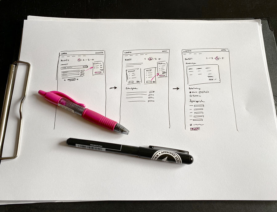
- I started by sketching up a simple flow to replace the previous one-step solution for discussion within the team.
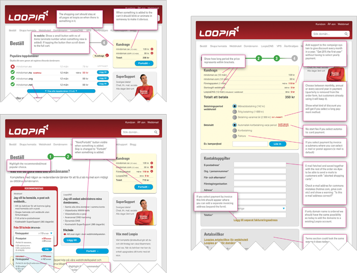
- After that I went on creating proper prototypes and performed user testing and interviews both internally and with customers and resellers.
- Finally I held a company wide presentation to get more thoughts and feedback especially from the customer support team.
Phase 3: Implementation and launch
I supported the frontend and backend developers during the implementation.
Before the official launch we…
- …educated the customer support team.
- …invited all employees and a group of customers and resellers to test it to make additional tweaks and get rid of bugs.
- …informed the entire company about the changes (why they were made and what we hoped to achieve).
- …arranged a “result guessing competition” internally.
Some of the changes compared to the previous order form:
- Multi-step process to simplify the choices.
- Personalization based on the customers’ needs.
- Introducing a proper shopping cart (actually very rare in the web hosting and domain name business at that point).
- Automated domain name suggestions.
- More visible discounts.
- Easy to search for additional domains.
- Extra services added (previously only possible from within the control panel).
- Multi year domain registration.
- Stored credit card (for 1-click-payments and/or for automatic payments).
- Abandoned shopping cart emails.
- Reduced the number of form fields.

Phase 4: To the future and beyond…
- After the launch I analyzed the customer behaviors again with Hotjar recordings and other analytics to find unexpected behaviors and issues.
- I am glad to say that the launch was very successful:
- The conversion rate increased with 34%
- The revenue per visitor increased by 28.7%
- With the help of A/B testing, analytics and visitor recordings we’ve kept improving the performance of the order flow even more. And together with the ongoing redesign of the website more changes will be implemented to improve the order experience even further.
Get in touch
I’d love to get in touch with you to hear about your goals and vision for your website or app. So don’t hesitate to send me an email or a message on LinkedIn.
…and hey! If we meet in person I will make sure to bring my favorite Swedish candy “Dumle-kola“. I think you will love it too :).


