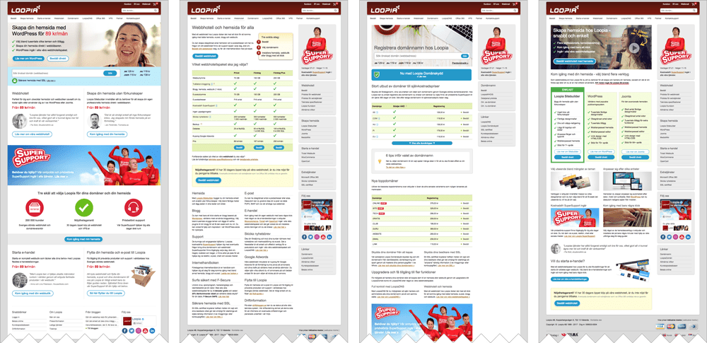
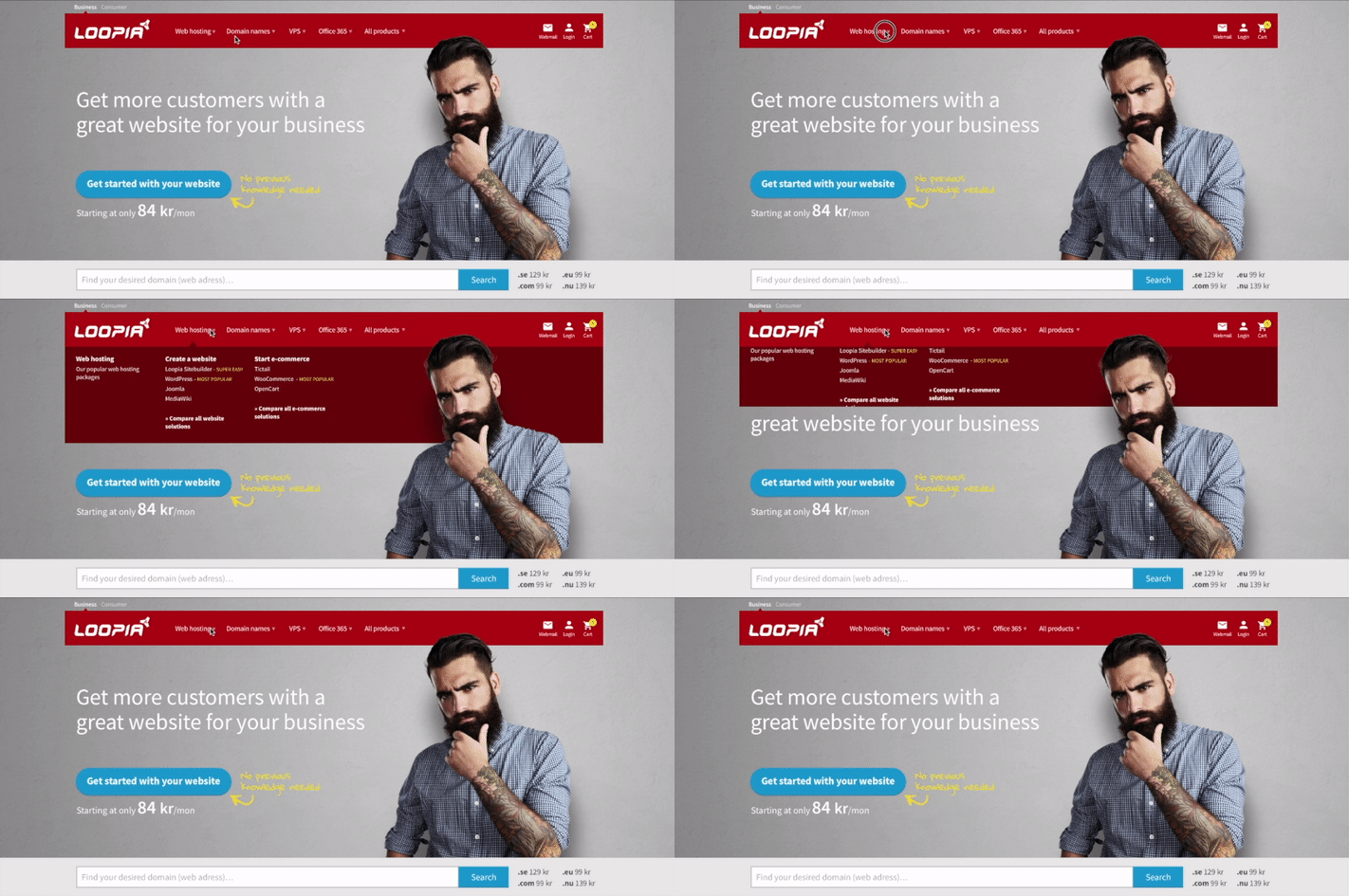
New design and structure of Loopia’s public websites
Company: Loopia
My roles: Project manager, UX researcher/designer and content planner.
Short description: The previous design was 8 years old and in need of a visual update. The website also needed a new structure to enable the now broader Loopia product portfolio. The backend technical platform needed a rebuild to meet modern standards and increased performance. Note that the technical part is not covered in this case study.
Phase 1: Define goals
The first step in my work process is always to learn about and/or define the vision and goals with the project.
In this case the goal was to create a better customer experience and increase sales by…
- …becoming more current and trustworthy as a web hosting service by modernizing the design.
- …create content and a structure that better fulfills the needs of the current product portfolio (the previous design and structure was made when Loopia only had web hosting packages and around 20 domain names. Now there are several more product types and a lot more domain names offered).
Phase 2: Analyze the current state and find new inspiration
All decisions regarding the new design were made as educated as possible by…
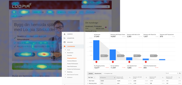
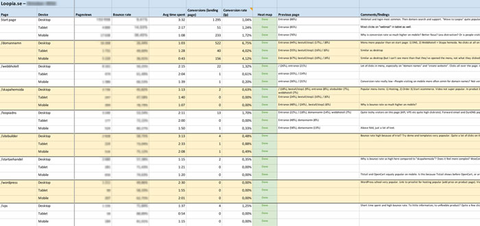
- …analyzing visitor behavior on the current website with tools such as Google Analytics and Hotjar.
- …investigating best practices within the area of business.
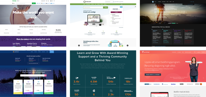
- …finding inspiration both among competitors and in other business areas.
- …running AB tests on the current design. Testing some thoughts and ideas for the new design on the current website to make the change in revenue per visitor as little of a surprise as possible.
- …compiling feedback Loopia received throughout the years but not yet acted on, as well as conducting interviews with customers, resellers and the support team.
Phase 3: Mockups and prototyping
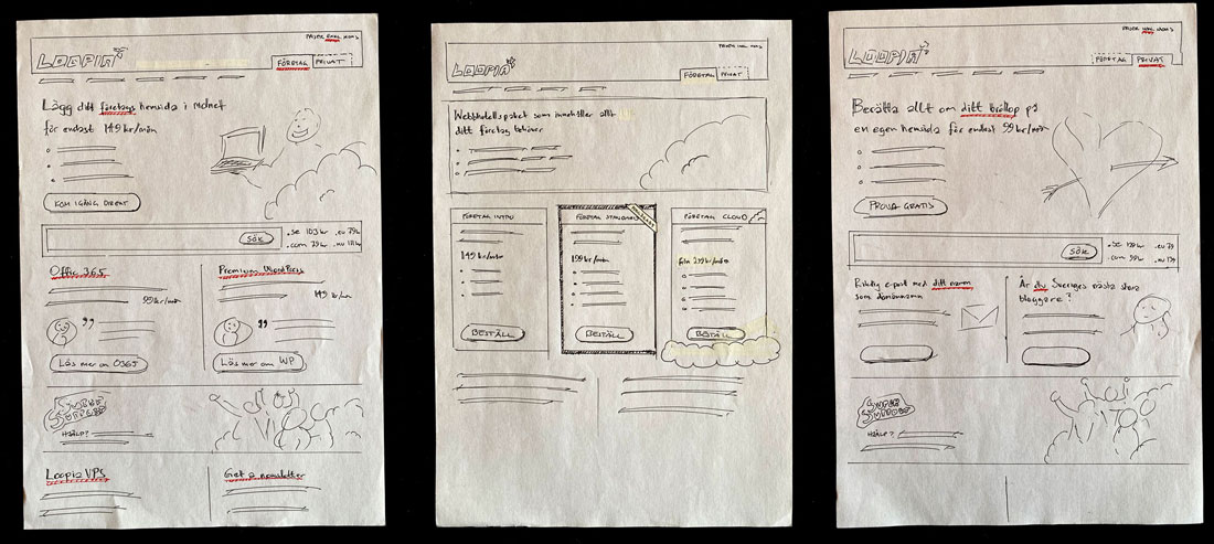
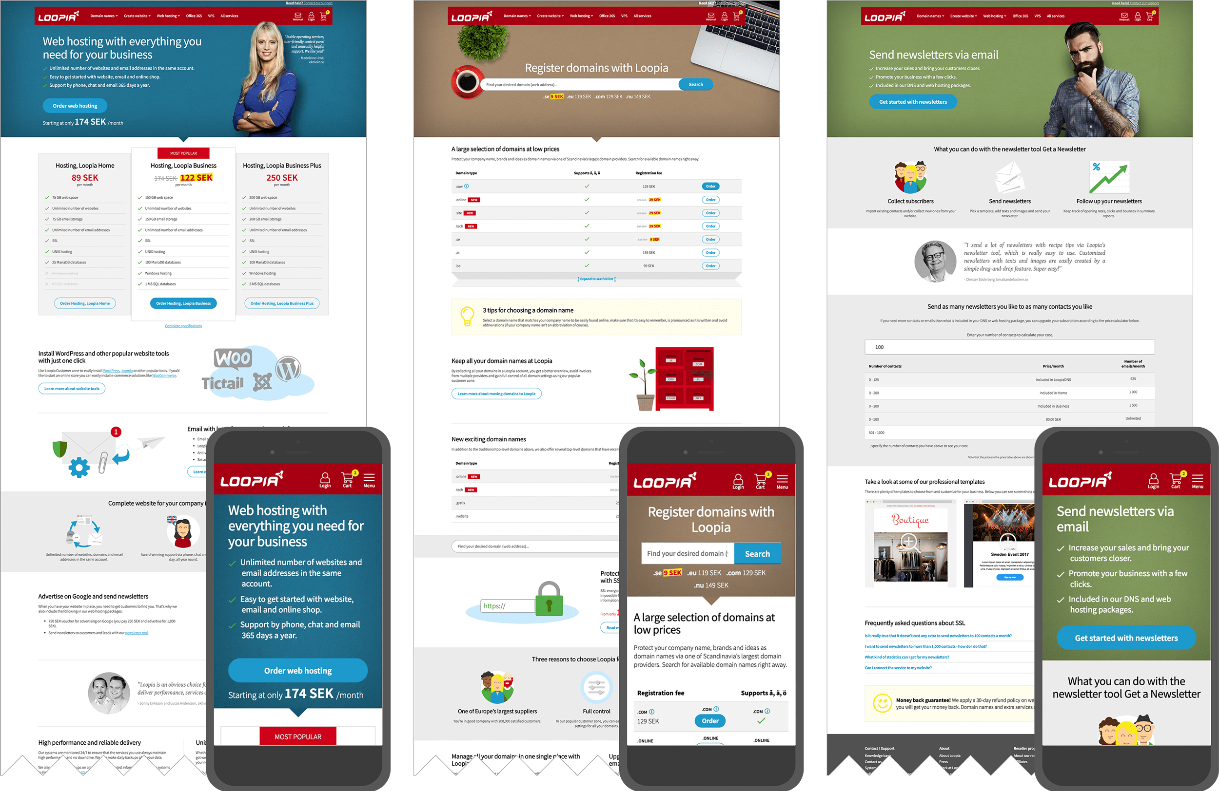
Based on the findings from the previous phase I started the design process by simple sketches on paper, then by creating wireframes and hi-fi prototypes using Sketch and InVision. Between the iterations I conducted feedback rounds, interviews and user testings internally within the team and other company representatives, as well as externally with selected customers and resellers.
Component based design system
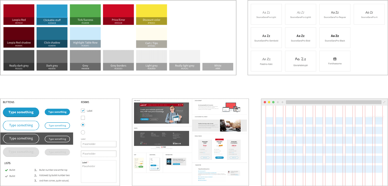
To create a cohesive experience for the user and also simplify the work for both the development team and the content creators, I created a component based design system that we based the entire website on.
Besides visual and structural modernization many general improvements of the website will be implemented. A few of these are...
A more personal and comfortable feeling
The majority of Loopia’s customers are small companies and their line of business varies from anything like hairdressers to restaurant owners or dog daycare centers. This means many (or even most) of them are not comfortable purchasing or managing domain names or web hosting services.
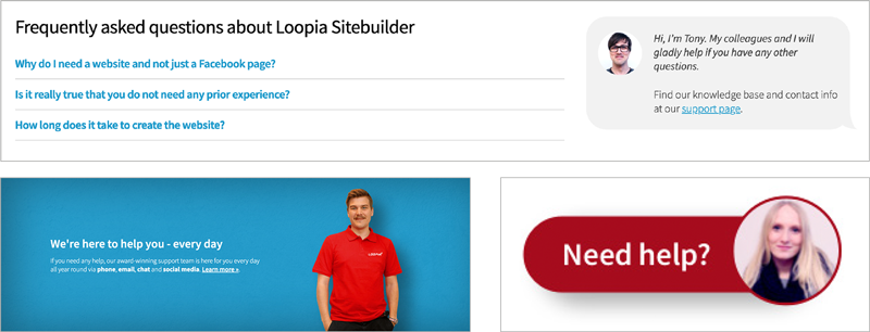
With that in mind I wanted to add extra comfort by showing existing happy (preferably local) customers for each product type with photos, quotes, videos and in some cases interviews. I also wanted to make sure that the visitor always feels the presence of Loopia’s native support teams in every market.
This also makes Loopia stand out from the competitors since it’s both expensive and hard for low price competitors or big international competitors to compete with great native technical support with generous opening hours.
Automatic scarcity
Another goal was to implement as many automatic features as possible to increase sales and usability. One example of this is that automated scarcity messages will appear next to the prices when a campaign is close to ending: ”The discount ends in X days/hours/minutes”
Functional animation
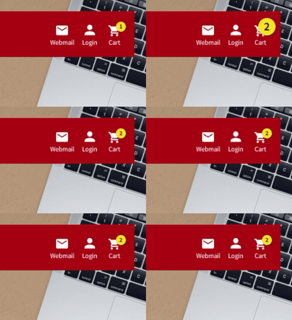
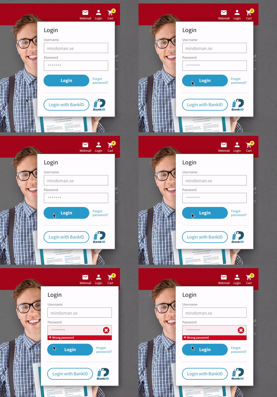
With functional and playful animations the aim is to strengthen communication messages and guide the customer. But also to contribute to a more delightful experience.
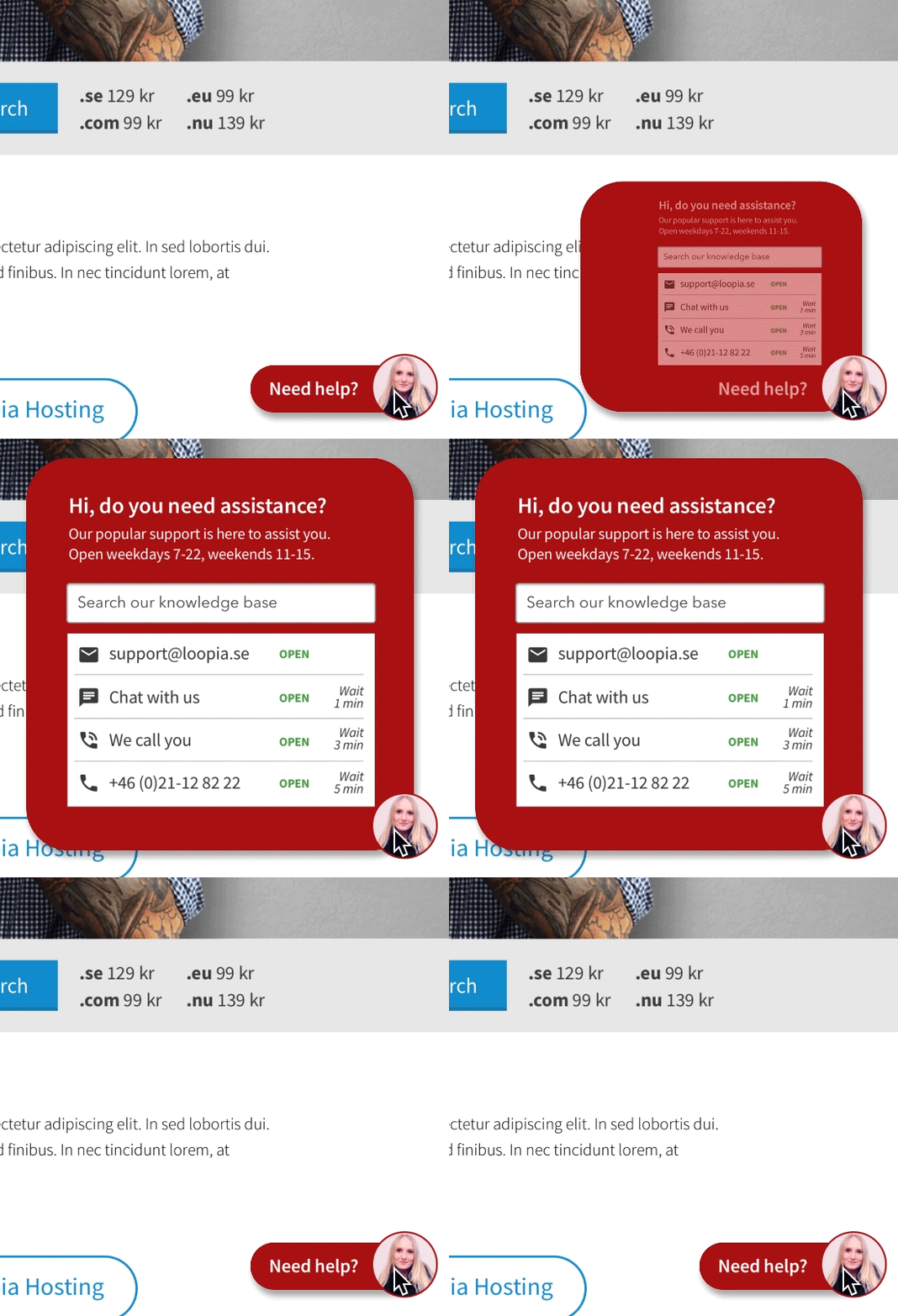
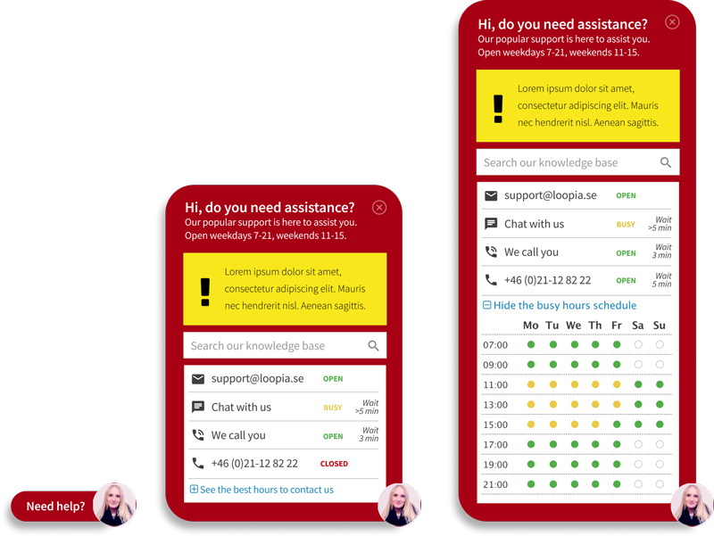
Dynamically updated info on customer support load
The great support team is one of Loopia’s most important resources.
To increase the possibility of to get a quick response via chat or phone, the support load is updated dynamically and we also show which days and times of the week you can normally get the fastest help.
If something unexpected has occurred that causes more customers than usual to contact us at a specific moment, we show a yellow information box including links to more information if needed.
Personalization
The plan is also to use a personalization tool to show different content for the visitors based on:
- geographics (local customer quotes, native support team etc)
- number of previous visits (e.g. domain names are often purchased on the first visit, and hosting services has an average of four visits)
- source (coming from different ads etc)
- previously been logged in (e.g. an existing customer should not be promoted to something they already subscribe to)
Phase 4: Content creation
SEO analysis
Originally the plan was to divide the website into two separate areas (business and consumer) with targeted content. But after doing the SEO analysis and also conferred with an SEO expert that had experienced problems both from an SEO perspective and customer perspective we decided to skip that approach.
Sitemap
Based on the SEO analysis and Loopia’s now much broader product portfolio compared to when the content was structured for the previous website I made a suggested sitemap together with the product team and the marketing team. In all cases where the URL would change we also made sure that 301 redirects were added for the old URL to keep the earned SEO strength and avoid broken links.
Content
Text
With the SEO analysis and feedback from customer support and the product manager we wrote all content.
Images
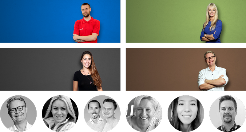
Hero images: Since Loopia had limited resources for photographing and wanted to have many customers represented on picture we decided to go with a photo style where the person on the image can be photographed in any studio by any photographer around the world and then we add a drop shadow and colored background to create cohesiveness. This also makes it possible to use stock photos in cases where we don’t have a photo of a customer.
Quote images: For customer quotes, Loopia often often uses images taken by the customer her/himself. This means the quality may differ a lot, so I decided to go with black and white photos to make them as cohesive as possible and also to make it easier to hide quality issues.
Illustrations and icons
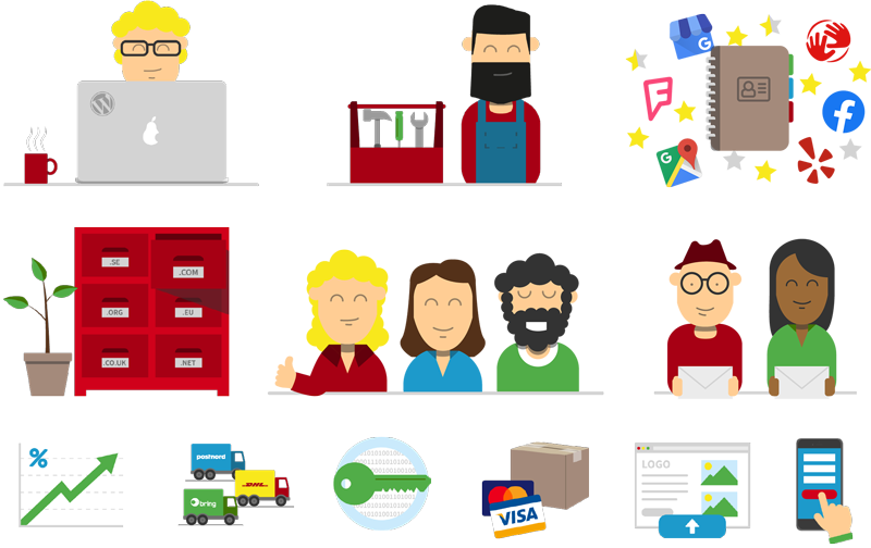
We created a simple style of illustrations, and then created all the illustrations and icons needed inhouse. For UI icons we use Font Awesome 5 Pro Light.
Phase 5: Implementation
The new website is still not completely implemented, since during this period Loopia acquired competitors both in Sweden, Finland, Slovakia and Hungary. This led to shifting focus for a long period for the development team, migrating customer bases etc. A quick and temporary visual update based on the new design was made in the beginning of 2020 by the frontend developers, but the backend, the new content and a lot of the features and visual updates are still not implemented.
Phase 6: Beta and launch
Since it’s a big change and it affects the main revenue source regarding new customers the launch plan was cautious:
- Internal beta for the entire company to test.
- Invite a group of customers and resellers to a closed beta for a brief period to get initial feedback.
- Run an A/B test with 10-20% of all visitors for a couple of weeks where half of these visitors sees the new website and the other half the old one, to make sure the revenue per visitor won’t decrease dramatically (but hopefully increase dramatically ;)).
- Public launch to all visitors.
Phase 7: To the future and beyond…
Since I have moved on from Loopia to another employer I don’t know the details of the current situation. But as for all websites or apps I work with my plan was to evaluate the result from a sales perspective and a user perspective and then keep optimizing and improving based on data, A/B-tests and feedback.
Get in touch
I’d love to get in touch with you to hear about your goals and vision for your website or app. So don’t hesitate to send me an email or a message on LinkedIn.
…and hey! If we meet in person I will make sure to bring my favorite Swedish candy “Dumle-kola“. I think you will love it too :).
